
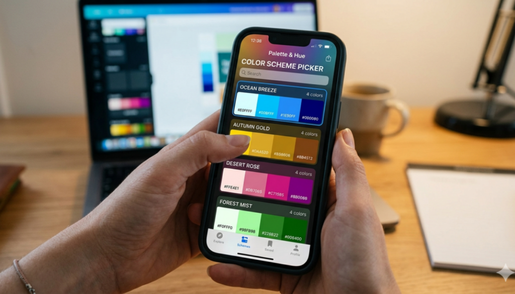
How to choose your brand color scheme
Hey everyone, and welcome! Today we’re talking about one of the most powerful — and most overlooked — branding decisions you’ll make as a dating site founder: your color palette. Before someone reads your tagline, before they scroll through profiles, they see your colors. Those colors trigger an emotion. That emotion decides whether they stay or bounce. This tutorial is built specifically for niche dating sites — because if you’re building a community for, say, pet lovers, or gamers, or people over 60, your color strategy is going to be very different from a generic swipe app. Let’s build it right.

Color Psychology & Emotion
Color psychology is the study of how colors influence human behavior and emotion. For a dating site, this is gold — literally. Let me give you some quick examples. Red triggers passion and urgency. That’s why sales buttons are often red. But on a dating site, too much red can feel intense, even threatening. A niche for extreme sports daters? Red might be perfect. A site for widows looking for companionship? Probably not. Pink says romance and warmth. It’s a classic for dating — but lean into a dusty rose or mauve to avoid looking like a teenage app if your audience is 35+. Here’s the exercise I want you to do: write down ONE word that describes how you want users to feel when they land on your site. Excited? Safe? Intrigued? Playful? That one word is your color compass.
Color by Niche
This is where niche dating sites have a massive advantage over generic apps. Tinder, Hinge, Bumble — they all live in the same pink-red-orange zone. You don’t have to compete there. If you’re building for outdoor adventurers, earthy greens and sky blues immediately say ‘this is for you’ the second someone lands on your page. You’ve communicated your entire audience in one visual beat. I want you to open up your competitors’ sites right now — or look them up after this video. Screenshot their homepages. Notice their color patterns. Then ask yourself: what’s the gap? What color says ‘your niche’ better than what’s already out there?
Building Your Color Palette
A common mistake I see with dating site founders is they pick one color they love and call it a day. But branding requires a system. Here’s the 60-30-10 rule: 60% of your visual space uses your dominant neutral or primary color. 30% is your secondary color. And 10% is your accent — the color that makes people click. Let’s say you’re building a site for bookworm daters. Your primary might be a warm, dusty burgundy. Your secondary could be a soft cream. And your accent — the ‘Message them!’ button — might be a rich gold. That palette says: literary, warm, a little luxurious. It’s cohesive. It tells a story. Go to Coolors.co and start building yours today. Lock your primary and let the tool suggest harmonious partners.
Cultural Considerations
This section is short but critical — especially if your niche crosses cultural lines. Color is not a universal language. White feels clean and bridal in the US. In several East Asian cultures, it’s the color of mourning. If you’re building for a cross-cultural niche, you need to know this before you design a single page. My advice: if your niche serves a specific cultural community, spend 30 minutes researching their color associations. Better yet, ask someone from that community what your color choices make them feel. It’s a small investment that can save you from a major disconnect.
Accessibility & Contrast
Accessibility is where a lot of small business owners say ‘I’ll deal with that later.’ Don’t. Here’s why. First: roughly 8% of men have color vision deficiency. If your dating site has a user base of even 1,000 men, that’s 80 people who may struggle to read your interface. Second: low contrast text is one of the most common complaints users have about apps and websites — even people with perfect vision struggle with it on phones in sunlight. The fix is simple. Go to WebAIM’s contrast checker. Paste in your text color and background color. It will instantly tell you if you pass or fail the WCAG standard. If you fail, adjust your shade slightly until you pass. This takes five minutes and makes your site better for everyone.
Color & Typography Pairing
Your colors don’t live alone — they live next to type. And the pairing matters. Imagine a faith-based dating site using a warm cream and burgundy palette. Then they slap a thin, tech-looking sans-serif font on it. There’s a disconnect — the colors say ‘timeless and warm’ but the font says ‘startup app.’ Your users won’t consciously notice it, but they’ll feel something is off. A Playfair Display or a Cormorant Garamond heading paired with that cream and burgundy? Now everything sings the same song. Spend some time on Google Fonts. It’s free. Pick something that has personality — and run it past 3 people in your target audience before you commit.
Color Formats: HEX, RGB, CMYK
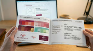
This is the practical stuff that saves you money and headaches. Every color in your palette exists in different ‘languages’ depending on where it’s being used. HEX is for the web. CMYK is for print. If you send your web developer a CMYK value, they’ll be confused. If you send a printer a HEX code, your colors won’t match. The solution is simple: when you finalize your palette in a tool like Adobe Color or Coolors, download the full export. It gives you all the formats in one shot. Keep that file. It’s the foundation of your brand guide.
Consistency Across Touchpoints
Here’s a question: if a user sees your Facebook ad on Monday, gets an email from you on Wednesday, and visits your website on Friday — do all three look like they’re from the same brand? For most early-stage sites, the answer is no. And that inconsistency quietly erodes trust. The fix isn’t complicated — it’s disciplined. Lock your HEX codes. Build a simple template in Canva for social posts. Give every contractor you work with your brand guide. Your brand guide doesn’t have to be 20 pages. It can be one page with your logo, your 5 color codes, and your two fonts. That’s enough to keep everyone on the same page.
Real-World Brand Examples
Let’s close with some real-world perspective. Tinder is red-orange. That’s urgency. That’s swiping. That’s dopamine. It works perfectly for what Tinder is — a high-volume, fast-paced matching engine. Bumble chose yellow. Yellow is almost never used in dating apps. That’s the point. It’s warm, optimistic, a little unexpected — and it stands out in an app store full of red and pink. Now look at your niche. Who are your people? What brands do they already love? An outdoor adventurer might love REI’s earthy palette. A gamer might love Razer’s neon-on-black aesthetic. A bookworm might love Penguin Classics’ typographic elegance. Your color palette is a love letter to your audience. Make sure it speaks their language.
Tools & Next Steps
Alright, let’s bring it all together. You now have the framework: understand the emotion, match it to your niche, build a system, check your accessibility, stay consistent, and document everything. Here are your tools. All free. No excuses. Coolors for your palette. WebAIM for accessibility. Google Fonts for type pairing. And a simple Word doc or Canva page for your brand guide. You’re building something for real people looking for real connection. The colors you choose will be the first signal you send them. Make it count.
Reach out to [email protected] for additional questions or consulting sessions.